New solutions for better music discovery
An evaluation and redesign for the Musi app based on user research.
CHALLENGE
Improve the experience of music discovery
ROLE
UX Designer
TEAM
Ben Dunkel and Irene Oh
DATE
October 18-28, 2021
Overview
This spec project was a 2-week design sprint as part of Genreal Assembly’s UX Design Intensive. Myself and my partner, Irene Oh, were tasked with deigning new features for the music streaming app, Musi. The goal of the project was to create new features that could improve the experience for users who want to discover new music. As UX designers we were asked to design a potential responsive design solution that allows users to discover music according to their preferences or enhance their current experience.
Musi is a free music streaming app that launched in 2013. It is one of the most downloaded music services on the Apple app store and boasts a deep library of content. Musi allows users to stream music and videos from YouTube, create and save their own playlists, and listen to audio in the background while the app is minimized.
For this project our team followed the double diamond design process. We began by researching the problem through interviews, surveys, and business analysis. Then we clearly defined our problem though the problem statement and persona. After this we moved to the design phase, developing our prototype and testing it with users. And finally, the delivery phase, in which we created a hi-fidelity mockup and shared our results with the class.
Table of Contents
User Interviews
As we started the project, our team interviewed five people about their music listening habits. Users reported using various streaming platforms such as Spotify, Apple Music, and YouTube. After conducting these interviews, we identified some commonalities and pain points. Our interviews revealed that users were generally not satisfied with the music discovery services of their current streaming platform. The way that algorithms delivered the music was not effective and users rarely use the features as a result. Users also reported that mood and tasks were huge influences on their habits.
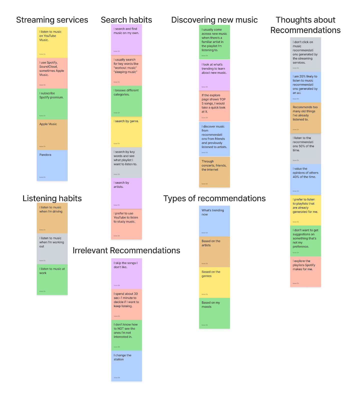
Interview Takeaways
Search habits:
- Users search music by keywords, categories, genres, artists, and moods.
Listening habits:
- Users like to listen to music when they are working out, driving, studying, working, etc.
Thoughts about recommendations:
- Users don’t want to get suggestions on something that’s not their preferences.
- 4 out of 5 interviewees answered they are unlikely to listen to recommendations generated by the streaming services because they prefer searching by keywords.
Types of recommendations they would listen to:
- Trending now
- Based on the artists they listen to
- Based on the genres they listen to
- Based on their moods
Online Survey
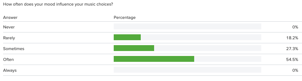
Our next step was to broaden our research by serving users online. Over two days, we received 13 responses the survey results confirmed some of our initial results. These results confirmed what we saw earlier, with just 18.2% of responses indicating that their mood rarely influences their music choice, and no one saying that mood never influences them. More than half of responses also said that they did not listen to music recommendations on their current streaming apps.
Competitive and Comparative Analysis
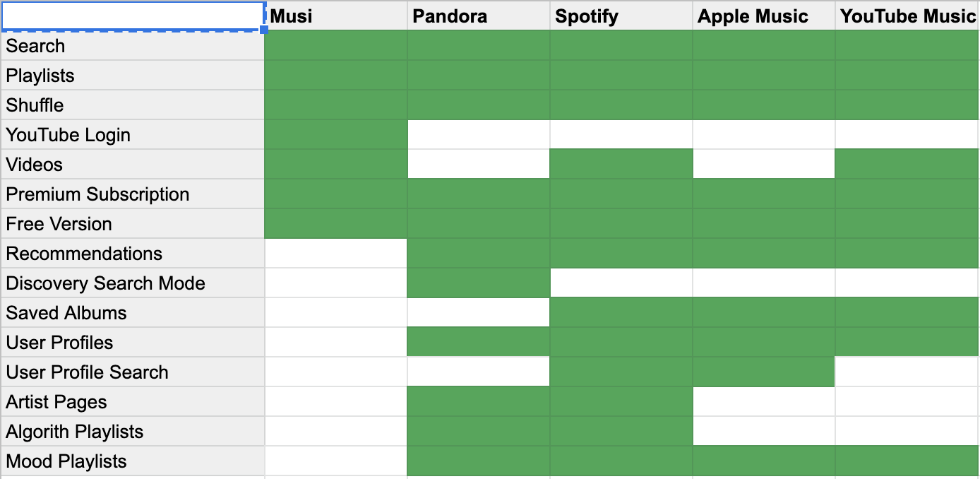
I looked at other brands in the streaming market to get an idea of what features they offered and how Musi could become more competitive. All of Musi’s competitors had more features but we could not simply incorporate all of them. So we narrowed our scope to the three areas where we saw the greatest potential impact for users. This inventory revealed a clear area of opportunity for Musi as far as recommendations, user profiles, and various listening modes.
I also looked at some of the top companies for recommendations to get an idea of what success may look like. Platforms such as Pinterest, Instagram, Netflix and YouTube all give users personalized recommendations based on their habits. Users are tracked through their profile to gain a better understanding of what content they like the most. These interactions provide valuable insight to companies and Musi would be well served to implement these features.
User Persona

Our team developed the user persona of Natalie to embody our target customer. Her goals and characteristics helped guide our decision-making throughout the design process. We broke the information down into three categories: behaviors, frustrations, and goals.
Behaviors
- When she’s at work she plays music based on the vibe of her restaurant and the time of day.
- She is more open minded when she’s at home or walking her dog so she likes to spend time discovering new music.
- She listens to music for motivation when working out and likes to hear all kinds of up-beat music.
Frustrations:
- She does not currently feel her music discovery needs are being met by algorithm generated playlists.
- The names of the playlists on Musi are unclear and confusing so she spends a lot of time looking for the right playlist.
- Her control over search filters are limited compared to other music streaming apps.
Goals:
- Would like to have a playlist generated for her based on the artist she wants to hear.
- To have more relevant recommendations based on her listening habits.
- Would like to follow artists and genres for new releases and updates in the community.
Problem Statement
Users like Natalie have trouble easily discovering music and want to hear new music based on how they are feeling.
Hypothesis
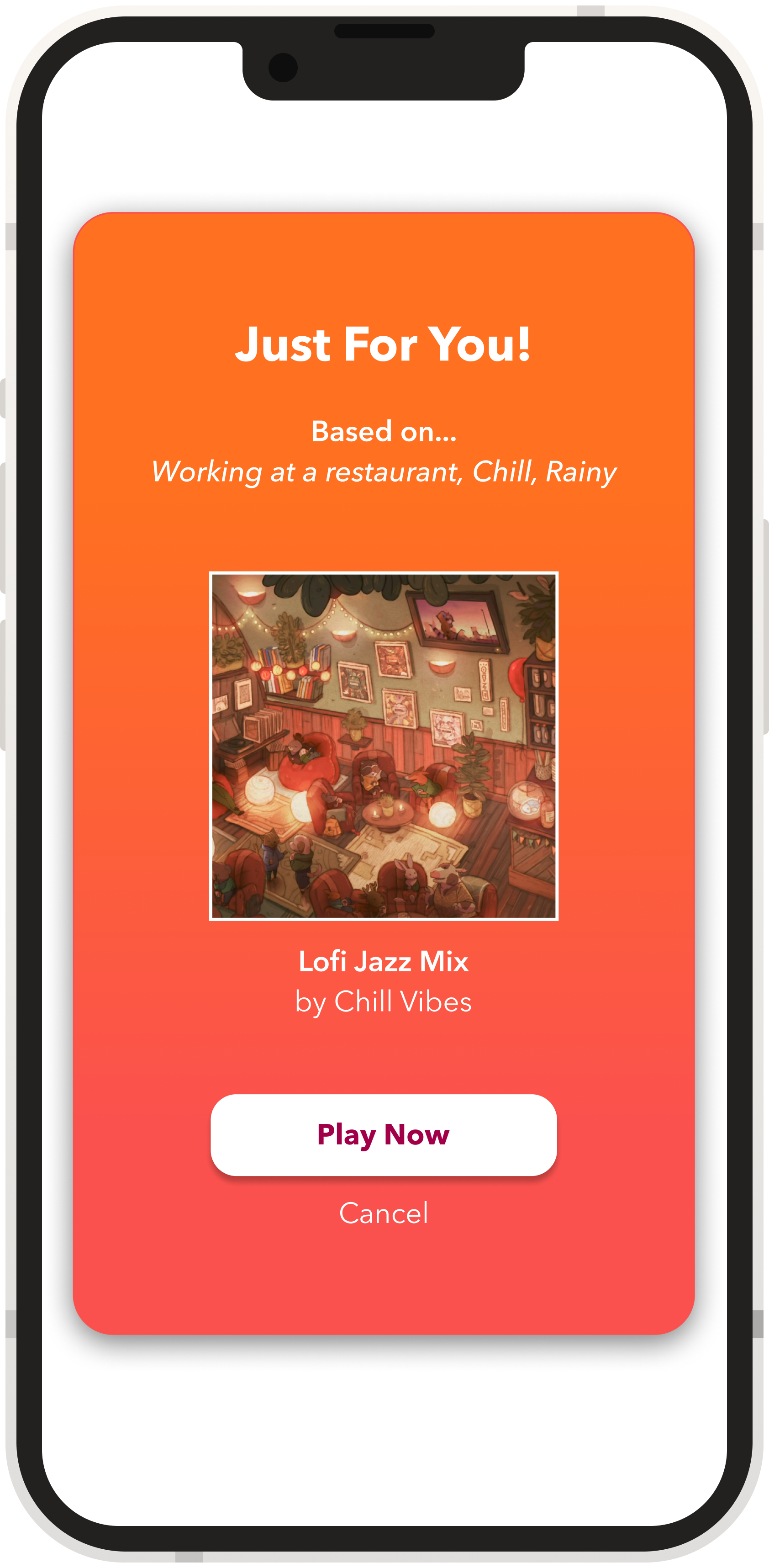
We believe we can give users better search results and increase engagement with recommended playlists by better understanding their moods and habits through frequent check-ins.
User Flow
I created this user flow to demonstrate how the new search features would be implemented. This example shows a user selecting a type of search mode before entering their desired selection. We can also see that the user then searches for a playlist using YouTube’s hashtags to narrow down their results. And finally, if a user likes the playlist, they have the option of saving it to their library for quick access later on.
Sketches
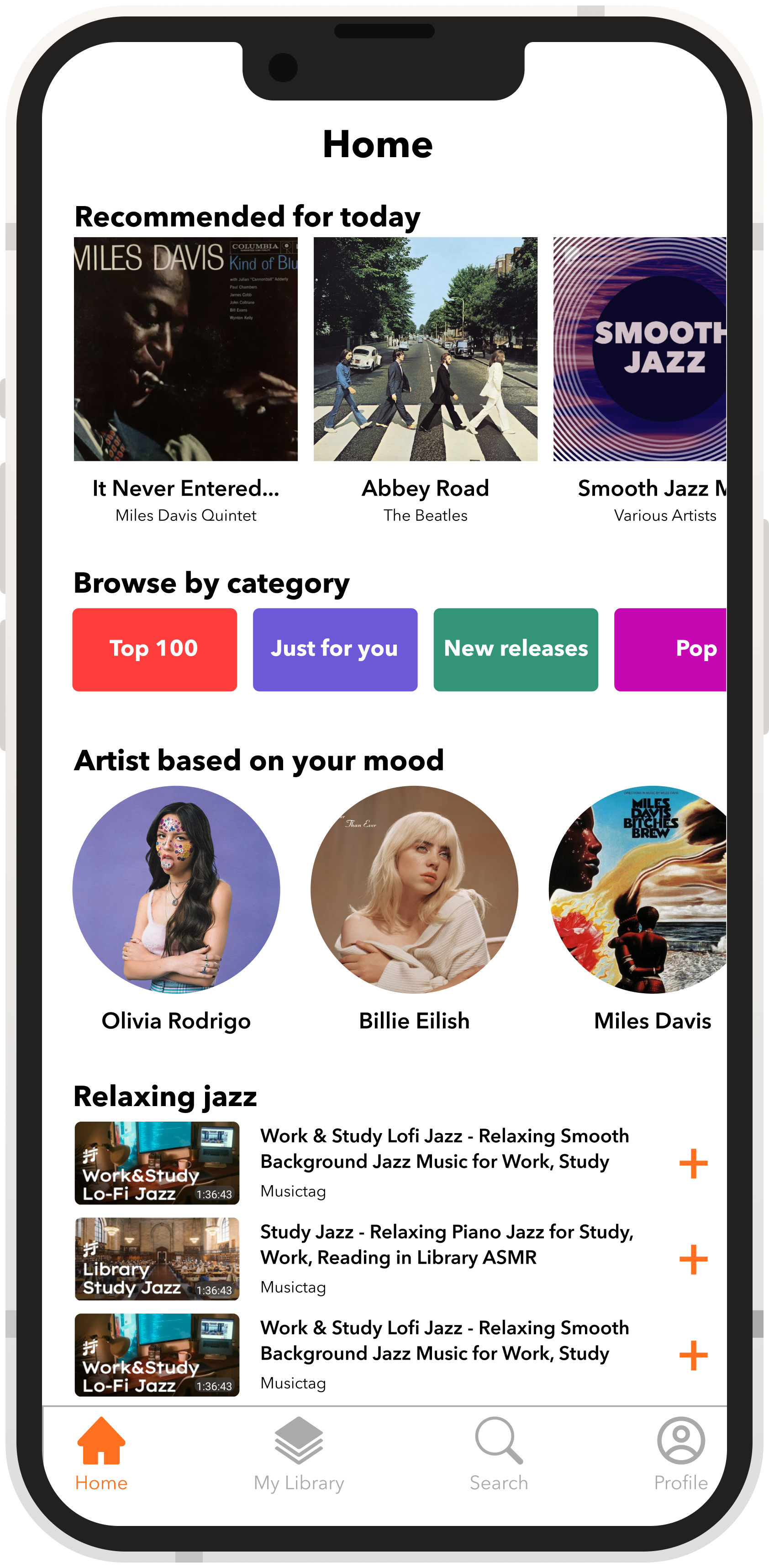
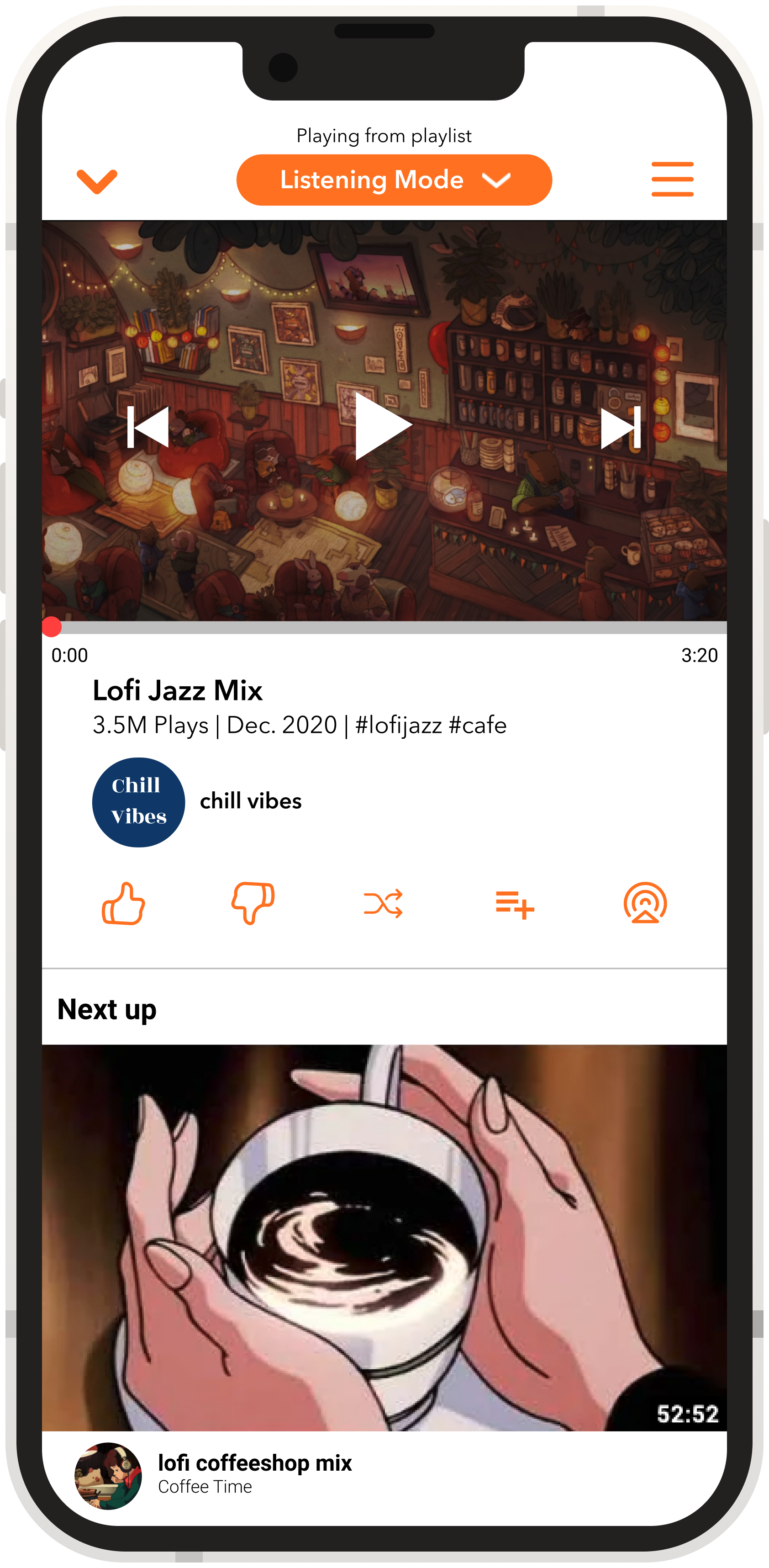
My sketches for this process were very important as they were tied to some of our biggest design changes. First, on the Home Screen, users are immediately greeted with personalized music recommendations at the top of the page. The search page has also been updated to feature suggestions based on users habits as well as the new search modes. The song page had one of the biggest overhauls. By moving the playback control buttons from underneath the video, to a contextually accessible element over the video itself, we were able to free up a lot of screen space. This meant we could emphasize our other features such as the playlist functionality or thumbs up and down.
Lo-Fi Prototype
We created a low-fidelity prototype using Figma. This grayscale interactive mock-up represented the user flows we had previously outlined. The prototype was used primarily for user testing and served as the foundation of our final product.
Usability Testing
Our team conducted usability tests with users to learn about the effectiveness of our initial design. The first issue that users reported was that the swipe gesture did not give them enough information about what action they had just completed.
The second issue users brought up was the lack of a change state indication when a song is added to your playlist. Some sort of notification was going to need to be implemented to confirm to users that they had successfully added a song to their library.
Design Iterations
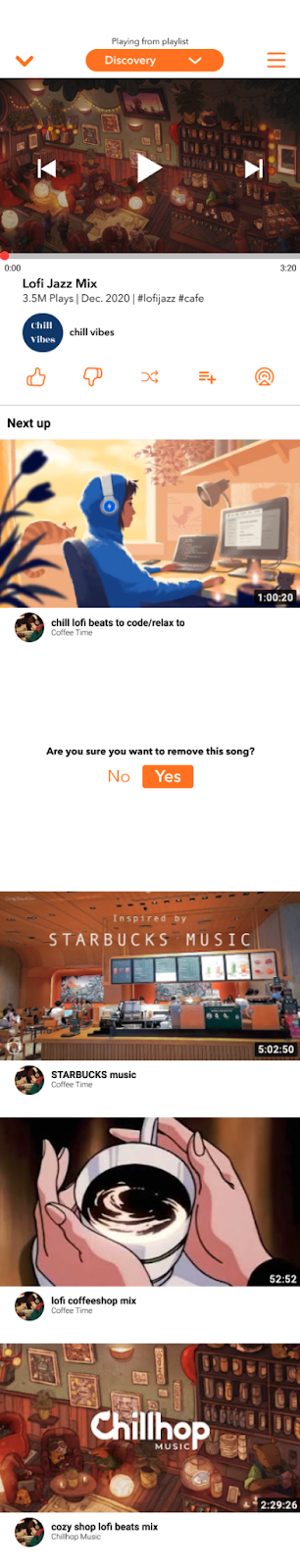
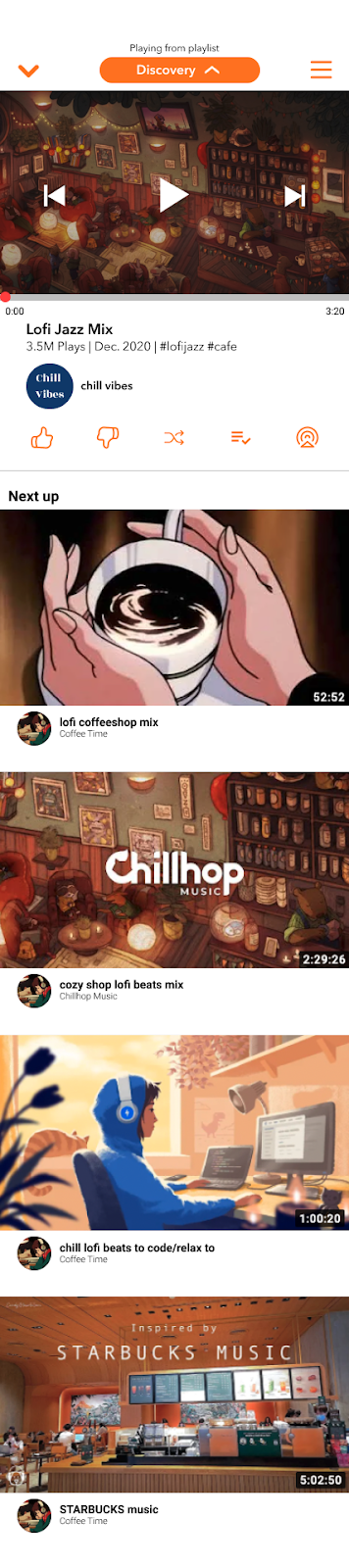
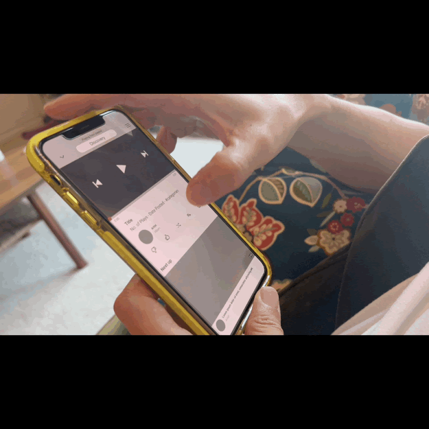
Based on the feedback we received from usability testing we went back to update our designs. We needed to address these issues before moving on to our final deliverable, the hi-fidelity prototype. In response to the issue regarding the swipe action, we added a text prompt asking the user if they are sure they’d like to remove a song from their playlist. And for the playlist button, a new icon was added featuring a checkmark to show users they’ve successfully saved the song to their library.
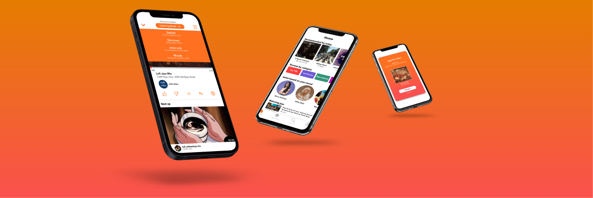
Hi-Fi Prototype
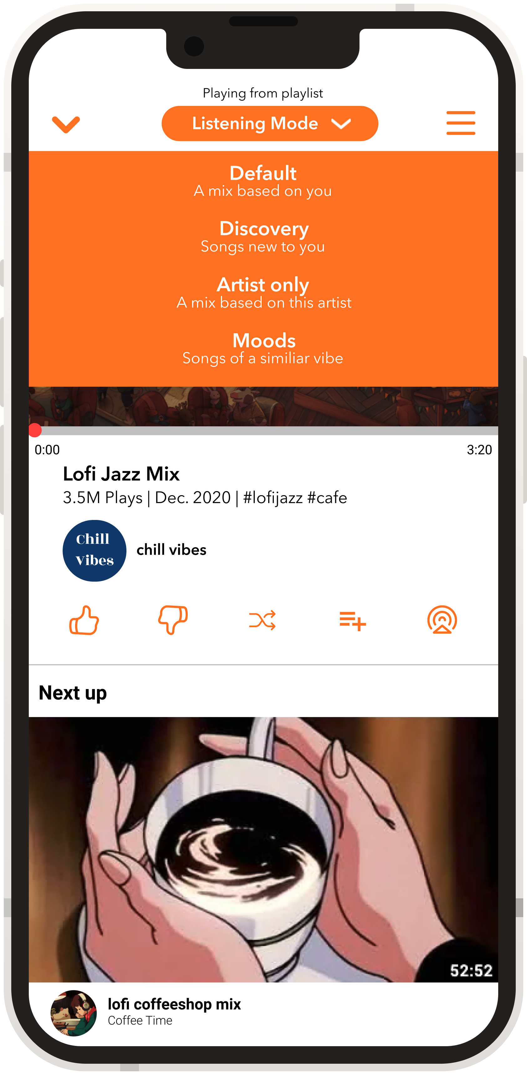
Our high-fidelity prototype was created collaboratively in Figma. It showcases all of the new features that we designed such as the daily check-ins, the various listening modes, the new ability to search using hashtags, and the new swipe gestures.
Final Product
We showed our finished design to our classmates in a 20 minute Zoom presentation. I was responsible for the opening 10 minutes of the presentation and led the audience through the first half of our design story.
Summary
The goal of this project was to design new features to improve the experience of discovering new music on the Musi app. Through our initial research we determined that users listening habits are strongly influenced by factors like the task at hand or how they’re feeling. As a result, we designed features that allow the user to share that information with the app and therefore get more personalized recommendations.
This project was a great experience for many reasons! As the first group project of the General Assembly UXDI course, I really enjoyed collaborating. From the first day when we set our team expectations, we were on the same page throughout the process. We set an ambitious schedule for ourselves and met our goals at every step. As for next steps, if there was more time to work on this project our team would have loved to continue working on a responsive design for tablets. The extra screen space allowed us to design screens that would not be suitable for mobile interfaces. That being said, I’m very proud of the project we delivered and am excited to start the next one!